Saturday, 5 April 2014

Gary Fernandez

Gary Fernandez 


Detail in simplicity is a theme that Gary Fernández has been perfecting throughout his illustration career. His perfectly rhythmic and orchestrated compositions work almost like a ballet, where all the characters are acrobats, dancers or gymnasts on a big stage. There is also an intriguing darkness in his characters that catches the viewer's attention. Sometimes his illustrations tell a story, sometimes it has a way of enabling you to imagine one. "My work is about telling the same in a new way, in a kind of very personal way". I love how he did all his illustration , putting a story behind them , i feel that every illustration or art work should have a story behind it, because it means something important to the artist or designer, thus, making it more priceless too . 

Below are some of his illustrations. 


 I love the idea of fading the figure hair in the direction of leading it to notice the house behind. Every illustration of his, tell many different type of stories, everyone had different view of his illustration . One day , i'll be a great illustrator and a great artist like him . 


Every week when i am writing a blog , i learn different techniques, and today, the technique i learned is creating a story behind every one of my own illustrations, because every one of them does not come easy . Such as, the inspiration and feeling that came into my mind on that precious golden moment. 


I love the way how he made everything in his illustrations meaningful, every single one of them meant something and it allows you to ask yourself why is it drawn that way. His illustration is never boring , never dead and flat because it is always alive and meaningful. Thus keeping the viewers and buyers keen for everyone of his illustration showcase. 


Masha Karpushina

Masha Karpushina 

Masha is a Moscow born, London raised freelance illustrator.The visual world she creates is dictated by observation of the real and the surreal. She is driven by the power of nature, the beauty within man and beast, traditions of past generations and the essence of love. After taking time out from having her second son she is currently involved in several personal and commercial projects. All images are hand drawn and later reworked in Photoshop.

Masha graduated from LCC (London, UK) with a BA (Hons) in Illustration for Graphic 

Design. In 2006 she entered the noisefestival.com competition where she became Paul Insect's choice for Illustration.

At the age of 30, inspired by her husband and a friend she began to run. So far it has 

dramatically changed her perspective on life for the better.  


Below are some of her illustrations, although most of her illustration are black and 
white, most of her illustrations are drawn from the vast colors of the world around her. 

The different strokes and tones she uses creates and allow us focus on what she wanted us to focus on, in such, from the illustration on the left, we focus on the darkest area first before moving the the body of the female figure than slowly noticing the male figure hugging her. 


It is almost like a collage of different texture created from the tone, you could almost feel the texture from her illustration above both smooth and rough, i could use this technique when illustrating the clothing i am designing, such as the texture of different materials can be drawn and illustrate by this technique.


This illustration above was designed for ALL SAINT. 

Her clients are :
Vodafone, Mercedes, EMI, Armada Skis, All Saints, American Eagle Outfitters, Soho House Magazine, Lascivious, Adventure Ecology, RCMM, Philippe Parreno


Diana kuksa (nesypova)

Diana kuksa (Nesypova)

Diana kuksa (Nesypova) lived in Moscow, Russian Federation. She is a painter, illustrator and a designer. I am posting an article on her because she is the one to watch , her copic marker rendering is simply amazing . The tones, the backgrounds and most importantly the strokes and the techniques. Below are some of her illustrations. 


These illustrations are inspired by MIU MIU S/S 2014 collection. The compositions are great and I love how Diana uses goldfish, jelly fish, and the cat prints to be the backgrounds. To me, the general vibe of these illustrations is very whimsical and at some point, the girls are a bit mysterious.


I love how she compose her background, she did not put all the gold fish at the back of her illustration, she created a overlapping over it . 

In this illustration above, it may seem easy but it is quite tedious , firstly she sketches the figure with pencil, tracing the fine line with 0.1-0.5mm micron pen , and lastly using copic marker to render it . All this requires a lot of time. 


I hope that you guys could look her up, because she is really a good illustrator and a painter, all of her works are amazing and furthermore, she is a very nice and friendly person, i've talk to her over the social network before and she always give tips on how to improve myself and my illustration . 

In courtesy of Diana Kuksa


Thursday, 27 March 2014

Petra Dufkova

Petra Dufkova

Czechoslovakian born Petra Dufkova is a freelance fashion illustrator 
and designer who now lives and works in Germany (well, some sites say she live in Germany.

 She showed promise almost immediately, winning a 'Best Illustration Award'
 at China Fashion week while still a student at the International Fashion School Esmond.

There isn't a lot of information surrounding her work ethics/life/inspiration,
 which is frustrating as she's such a talented artist.
 I'm taking this chance to help to promote her to the viewers of my weekly illustrator blog
 and hope that you guys could check out on her.
 
What I love about her technique is that her lines are so perfected,
 almost as if they had been created using a program. 
This makes her work look so crisp and modern, 
which is exactly why her main focus is on the edgy world of fashion illustration. 

Here are some of her illustrations. 


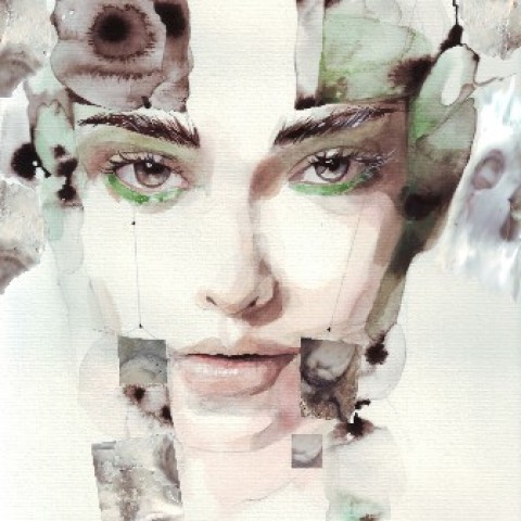
I love her technique so much, using water color and smudging some of the area to make the illustration came to live. Giving it texture and tones. 


In order to bring out the different tones of the facial features, time and experience is needed, one cannot do it without learning or the proportion and the perspective of the human face. 


She does collage too. Using a darker color. She could create effect such as the illustration above, making it look more interesting and surreal , its a technique i am exploring now too. Which is not easy because any mistake you done using the darker color , it is very difficult to tap away using a wet tissue paper.


delvin lim han wu , F13FD0304. 


Thursday, 20 March 2014

Katie Rodgers

Katie Rodgers


Boston-based Katie Rodgers is one of my favorite illustrators. I first came across her in one of my classmates Instagram and I’ve been a regular visitor to her website Paperfashion ever since. I love how Katie chooses an image usually from a fashion magazine or blog and then illustrates it in her own unique style in such as a few simple strokes could create a perspective of a dress or gown. 
Katie has been on the receiving end of a number of enviable commissions of late – most recently she worked with Coach for New York’s Fashion’s Night Out where she appeared in store and illustrated a number of handbags for a line of eager customers. 
dream closet March 14 2014


I love how the way she creates the lighting in her illustration, such as the white space she gave in her illustration and the different variety of tones and color in her design. 

dream closet March 2014

I feel that this is one of her best sentence she said 'I was never the top student in college, but i had a passion for illustrating' 
I agree with what she says because you dun have to be the best or the top student in life to follow your dreams and do what ever you love to do, if you have that passion, anything is possible , dun give up . 


dream closet March 2014

I love how she matches the color in the series of her dress illustrations. She uses 3d objects to make her illustration surreal too, which makes her design interesting and unique . 


Thursday, 27 February 2014

Laura Laine

                                                   Laura Laine


Laura laine is an amazingly talented fashion illustrator. She has studied fashion design at the University of Art and Design Helsinki, with a focus on fashion illustration. After completing her studies she has been working full-time as a freelace illustrator. Her clients include Zara, Tommy Hilfiger, H&M, Iben Hoej, Daniel Palillo, The New York Times Magazine, Elle Girl, The Guardian, and Páp Magazine.
Her predominantly black and white illustrations are hauntingly beautiful and delicate, but they sometimes have a rather dark or even eccentric, burtonesque feel to them. One of the main characteristics of her drawings is the incredibly fine and detailed line work, which manages to suggest a great variety of textures (fur, silk, wool, leather etc.). Further, there is a certain motion quality to her illustrations which is conveyed by the gracefully twisted body postures and the splendidly flowing long hair of her characters.


The above (apparently mirrored) illustration featuring two young women each holding a fox is entitled “kitsune” (Japanese for “fox”)
I really love the way how she creates the hair for every illustrations, the way each and every illustration move and bends is simply amazing . The refine line work of every strokes creates different tone and lighting to make the figure alive. 


                                                    This work above was illustrated by her for GIVENCHY. 
"Kitsune Noir" by laura laine. 
The Kitsune (Japanese for fox) has a long and fascinating history in Japanese culture. They are particulary well- known for shape-shifting into form of exquisitely beautiful women, especially with a narrow face with close-set eyes, thin eyebrows, and high cheekbones which make them look stunning to attract guys attention. 
The way she illustrates her design using the characteristic of the Kitsune is amazing , in such all of the characteristic of the Kitsune is perfectly apply into her work and every illustration, even though is a reflection, is totally different in every way.


Joe Eula

                       Joe Eula

Joe Eula was born in Norwalk,Ct, USA, around 1928


He began his career in the late 1940's, covering the fashion and social events with Eugenia Sheppard for the Herald Tribune. He then went to London and worked with Ernestine Carter doing the same for the Sunday Times. He also created eye-catching posters for Broadway shows and portraits for many celebrities, including Miles Davis, Marlene Dietrich, Diana Vreeland and later the Supremes and Liza Minelli. 
He says "I was considered the fastest pencil in the field, a mannequin need only do her turn down the catwalk at a fashion show, and voila - an illustration." His admirers rightly believe that Eula's dynamic impressionistic watercolours capture the essence of a designer's collection far more effectively than the standard catwalk photographs. 
Returning to America in the 1960's, he shared a studio with photographer Milton Greene, collaborating on covers, news and fashion stories for Life Magazine. Their partnership ended in 1968, after which Eula designed sets and costumes for the New York City Ballet, which was under the direction of George Balanchine and Jerome Robbins. 
He also worked very extensively with the designer Halston for many years. 
In the 70's, he diversified into television, directing "fashion specials" for movie stars such as Lauren Bacall and Candice Bergen. He won a Tony award for his work on the Broadway production of "Private Lives" in 1968. 
Joe contributed a great many illustrations for American Vogue. 
Later in the 1970's, he assisted Diana Vreeland, who was appointed head of the Costume Institute of the Metropolitan Museum of Art, in New York in 1971. 
In 1979, Joe Eula signed an exclusive contract with Italian and French Harper's Bazaar, for fashion illustrations. 
In the 1980's, he handled the fashion illustration for such houses as Missoni Knitwear, Chanel, Givenchy, Versace, Karl Lagerfeld, Yves St. Laurent and many others. When he is reporting on international fashion shows, Eula manages with a few rapid strokes of his paintbrush, to reproduce the line, colour and cut of an outfit in the short time that it takes for a model to parade down the catwalk. 
Another of Joe's activities for some time, has been the cover designs, artworks and illustrations for music CD albums for such artistes as Liza Minelli and many others. 
Joe Eula, is a familiar figure at the international collections, frenziedly sketching as the models saunter down the catwalk. His is still the fastest pencil at the shows. 
Joe Eula's tribute to Yves St. Laurent in March 2002, on the great French designer's retirement, was published in the magazine of the Sunday New York Times in March 2002. Joe was there for YSL's first show for Dior in the early 1950's and he was there for YSL's last show in 2002. He has been drawing fashion for 55 years.


                      Ilustration by Joe Eula, Mr Eula 2004. Rendering of a Moschino coat with pom pom . 
I really love how he illustrates and create something or i must say, bringing something to life, his illustrations are way more better than photographers that are trying to capture the essence of the designers collection. A few simple thick or thin brush strokes allows us to know the way the model is moving and where the light is coming from.

Joe Eula's illstration

This is a illustration of Halston fitting Lauren Bacall in a long cashmere dress in 1973. 
I really love how he creates the reflection of Lauren Bacall , the perspective is perfect, even though this illustration is created from a marker, you can see the type of strokes he is applying , thicker, thinner, to show the differences of the live figure and the one that is reflected , simply amazing. 

Roger Duncan

 Rodger DuncanBucks County, Pennsylvania, USA


Rodger Duncan was born in Bucks County, Pennsylvania, USA, and studied fine art at the Pennsylvania Academy of Arts. He received his masters degree after a year of studying painting in Florence, Italy. 
The artists he most admired were Picasso and Matisse, for their sense of colour and shape. 
His first commissions were advertisements for department stores and he later worked for designers Calvin Klein, Oscar de la Renta, Chanel, Ralph Lauren, Stephen Jones, Patrick Kelly, Carolina Herrara and Anne Klein. 
He was a young American illustrator, who worked at lightning speed and always with a live model. Said the artist "the model is the drawing, I am attracted to fashion illustration as a form of personal expression, interpreting the mood of the model according to what she is wearing. She is a young, active woman, her gestures and movements inspire me and because I work so fast she can always be caught in motion." 
There was a shape and feeling in Duncan's dynamic brushstrokes and glowing gouache colours, which, coupled with his ability to capture a likeness in just a few lines, were much appreciated by American Vogue. They regularly commissioned from him both fashion drawings and portraits of elegantly dressed socialites. 
He regularly contributed to Harpers Bazaar, the New Yorker magazine and American Vogue during the 1980's. 
The outstanding characteristic of Duncan's work was his use of blocks of high-voltage colour. His figures are free and easy, yet still sophisticated and with an undercurrent of energy concealed beneath a deceptively relaxed poise. 
He died an untimely death in the late 80's.


There was a shape and feeling in Duncan's dynamic brushstrokes and glowing gouache colors,which coupled with his ability to capture a likeness in just a few lines, all his works were much appreciated by American Vogue. They regularly commissioned from him both fashion drawings and portraits of elegantly dressed socialites.

Ponto de Econtro : Agosto 2010             
His first commisions were advertisements for department stores and he later worked for designers Calvin Klein, Oscar de la Renta, Chanel, Ralph Lauren, Stephen Jones, Patrick Kelly, Carolina Herrara and Anna klein. 

Saturday, 25 January 2014

Antonio Lopez

                                Antonio Lopez  (February 11, 1943 – March 17, 1987)


Fashion illustrator Antonio Lopez. From left : Eija Vehka Aho, Juan Ramos, Jacques de Bascher, Karl Lagerfeld.


           Antonio Lopez was born in Utuado, Puerto Rico. When he was seven years old, his family moved to New York . His parents, Maria Luisa Cruz and Francisco Lopez influenced him to apply his artistic talents to fashion. He attended the High School Of Art and Design and the Fashion Institute Of Technology. While attending the F.I.T. He began an internship at Women's Wear Daily, which led to him leaving school and working at the publication. Shortly afterward he left for a position at the New York Times.
          Lopez worked in close collaboration with Juan Eugene Ramos. He also did illustrations of fashion designs by Charles James
           In 1969 he moved to Paris along with Ramos and was an associate of Karl Lagerfeld and he stayed there until the mid 1970s.  


                    Antonio Lopez is the Picasso of fashion illustration. He capture the pulse of style from the 60s to the 80s , and is still revered as the most inspiring illustrator by today practitioners. He worked with a variety of materials including pencil, pen and ink, charcoal, watercolor and polaroid film. His work appeared frequently in Vogue, Harper's bazzar. Elle 


  Antonio Lopez

 Jerry Hall 

    Italian Vogue 1979 

          From his illustrations above, you could see the light is coming from the left, which made the left hand of the lady faded, and simple lines and strokes could allow viewer to have a three dimensional view of the drawing. Thin and thick lines allow the figure to be more realistic and surreal.

                                                    Antonio Lopez 

                                                      Fashion Girl 

                  Antonio uses watercolor in this painting as you could see the light and bright colors in the painting. According to my research, many people that says that watercolor art is a very powerful way to express your feelings . Even though i hate water colors,as i often destroy the drawings i drew when applying colors on it.  I felt that Antonio used this painting to express his feelings as women are becoming more fashionable and stylish.

Saturday, 18 January 2014

Katharine Asher

     katharine Asher an fashion illustrator,She was brought up on a farm in Dartmoor. She uses creative play to fill the social void and now she make a living from her favourite past time. She went through various design courses such as Diploma in Graphic Design ; Torbay College of Art & Design, LSIAD in illustration ; Harrow College of Art / London , BA hons degree in Fine Art ; UWE Bristol - specialising in sculpture.

      She learns so many different type of techniques from various different art courses, something that i should do too , exploring and learning different types of techniques that i could see and create in my daily life.


     Here are some of her illustrations.She uses a traditional drawing style such as Conceptual, line, line with color,Concept Art and Vector. She have worked as a freelance within illustration and designing line for many years, specialising in figurative work .
     For a fashion designer like me, i should move towards the path she is going too , As figurative work plays an important part for me to create emotions and the elegance of the clothes that i am going to design in the future. The technique from Harrow College of Art allows her to think three dimensions and a thorough understanding of anatomy and movement. This prove to be her backbone of her skill base, enabling her to attract wide variety of commercial source.


     From her work above. you could see she only uses simple colors and strokes to create the tones , three dimensional structure and the silhouette of the figures, it gives the viewers such as me, a soft and comfy feeling . I hope that i can apply those techniques in my illustration work.

   Creating simple lines and stroke allows viewers to determine where the lighting is coming from and she does not need to complete the figure to show its completed, it allows the viewer like me to complete it myself by thinking.
  You could obviously see the lighting is coming from the right as the left part of her face is darker because of the shadow.


The realistic shading and detail against the fun
juicy water color light strokes express a real heart-warming quality. A beautiful example of the elegant movement of the works the paintbrush.


  All this techniques and skills i could apply it in my next illustration lesson too . =)

-delvin lim